
Website + lookbook · 2026
Villa TimTavio — Website
The estate’s public face — an editorial teaser, a full-screen scroll-choreographed lookbook, and an invitation-only availability flow. Twenty-eight chapters and 50+ panels easing past the viewer in a day-to-night arc. Live in production.
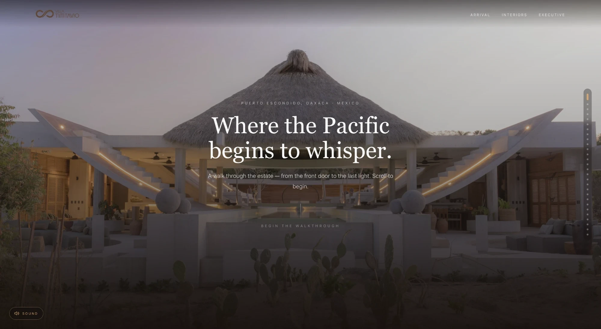
Overview
The site had one job: make the villa feel like a secret worth being let into. So it is built in three movements — a restrained teaser, an immersive lookbook, and a deliberately selective way to ask for a stay.
The whole thing is scroll-choreographed with Motion and smoothed with Lenis, so it reads less like a webpage and more like a short film you steer with the wheel.
Role
Design & build
Timeline
2026 · live
Stack
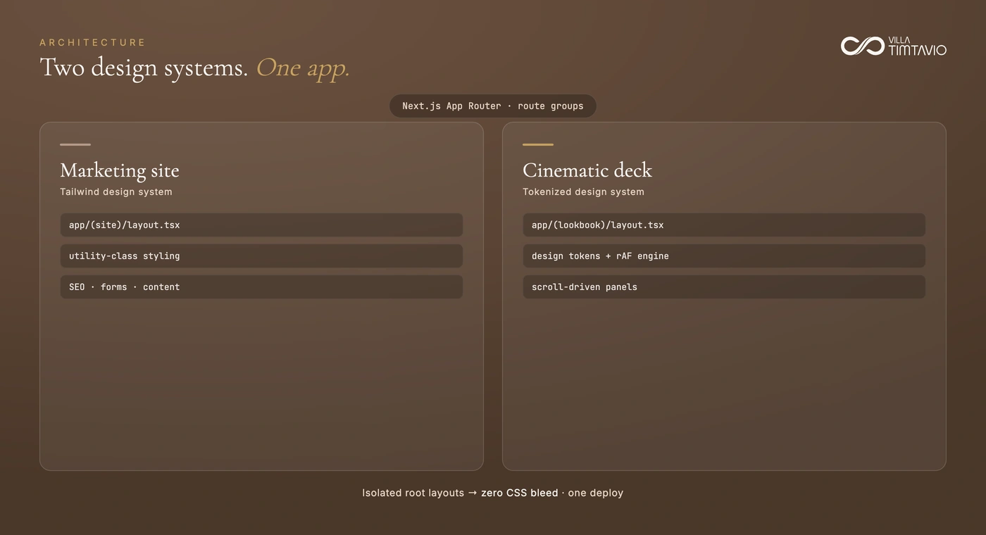
Two design systems, one deployment
The marketing site and the cinematic deck want opposite things: one needs utility-class styling, SEO and forms; the other needs design tokens and a scroll engine driving panels frame by frame. Rather than compromise both, they sit in separate App Router route groups with isolated root layouts — so neither stylesheet can bleed into the other, and the whole thing still ships as one deploy.
Enough to intrigue, not to explain
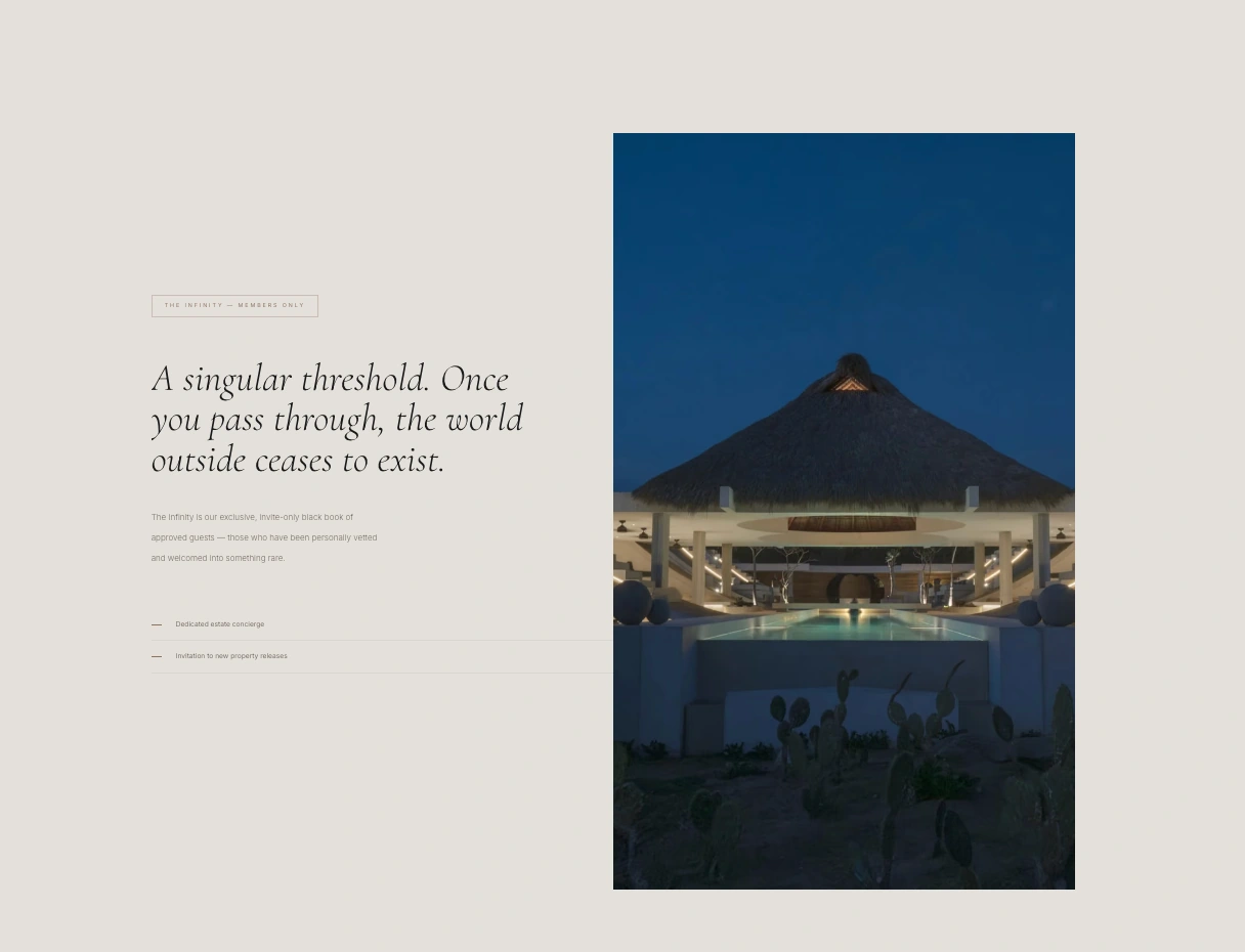
A single brutalist hero and a quiet stat line. “Enter the Infinity” is the only real call — and it’s a threshold: the whole site shifts tone the moment you cross it. The entrance is animated, so a short clip shows it best.
View the live site →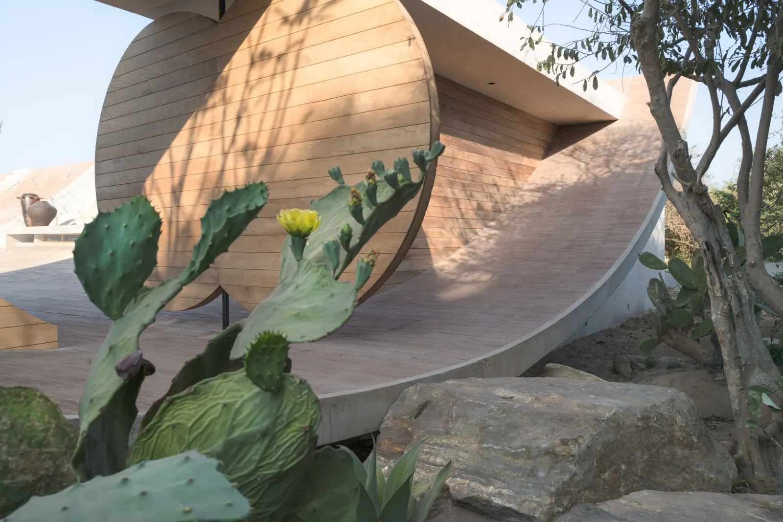
Twenty-eight chapters, one long breath
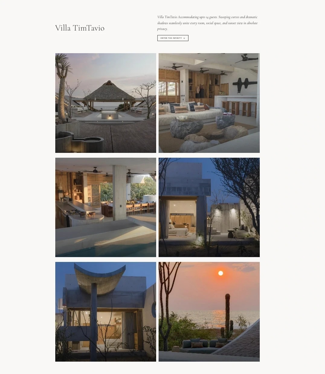
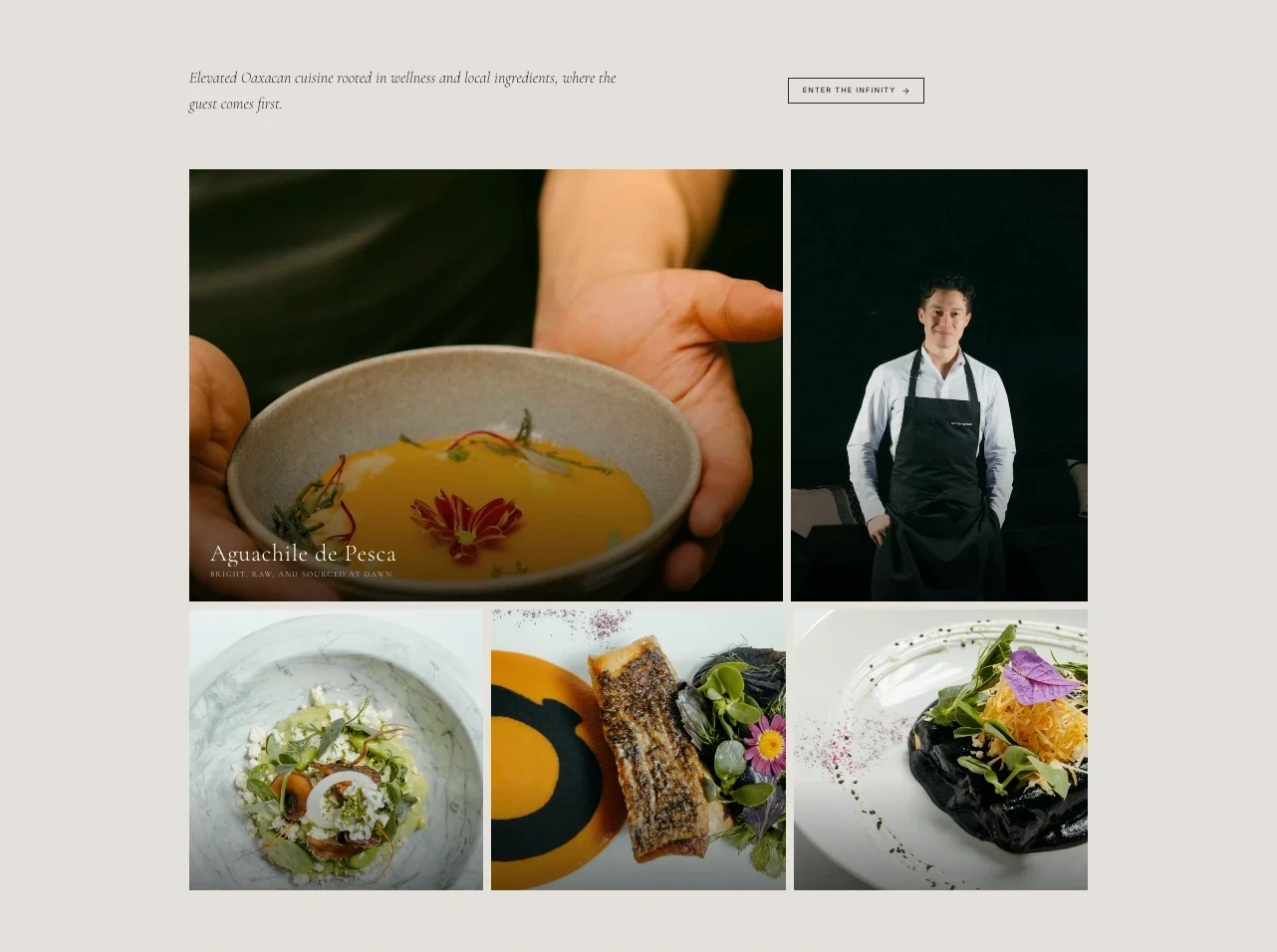
Past the threshold the site becomes a film — the villa, the cuisine, the experiences — 50+ panels easing by in a day-to-night arc. The choreography is the whole point, so lead with the walkthrough video and let the stills carry the detail.
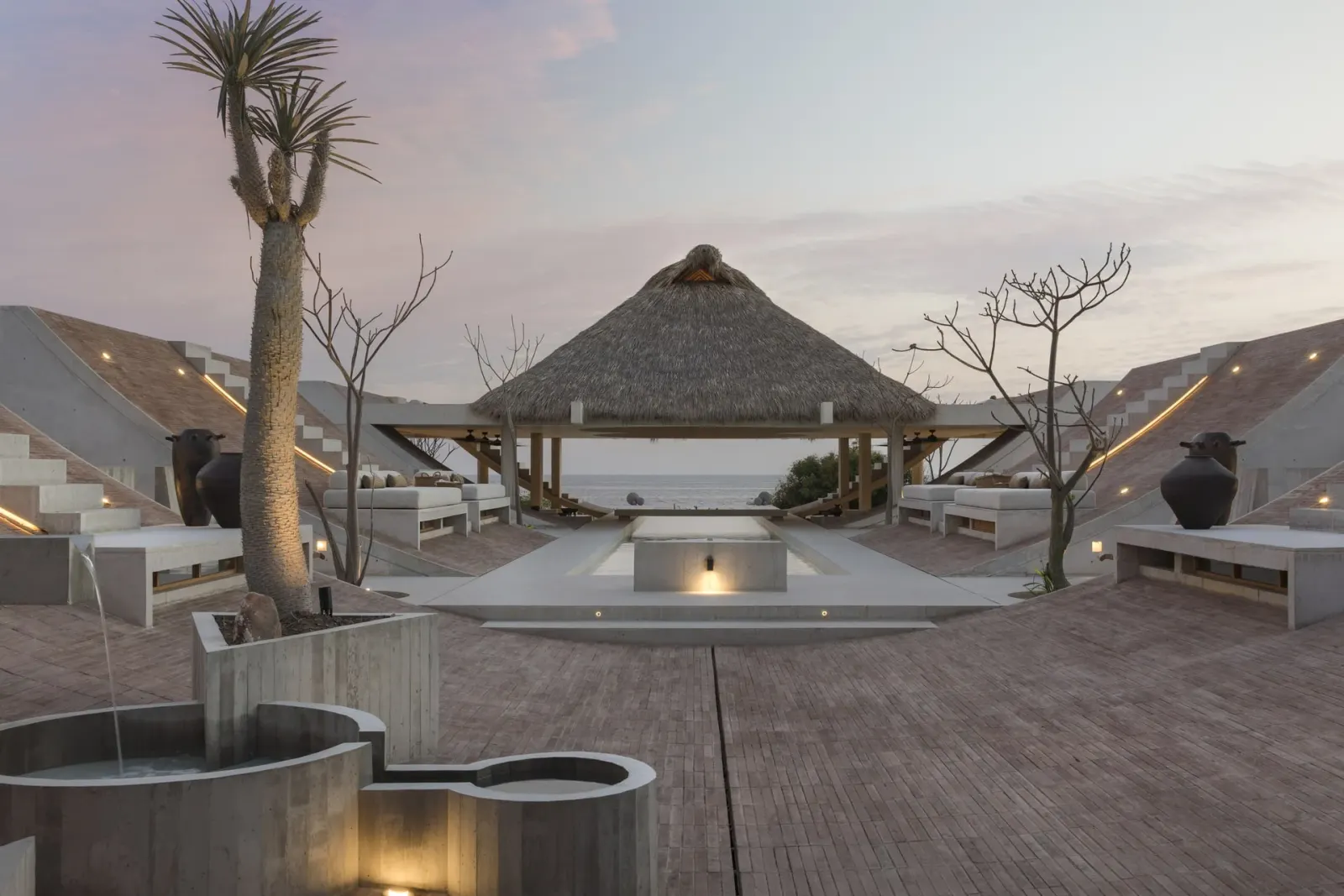
Two doors to a stay
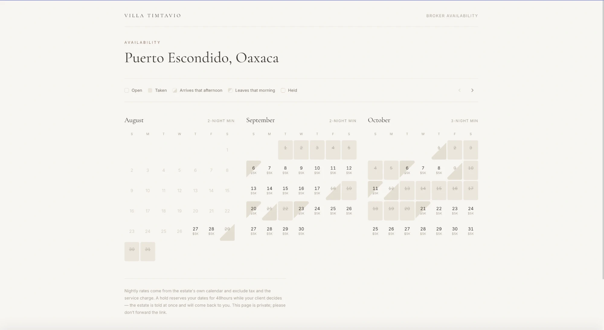
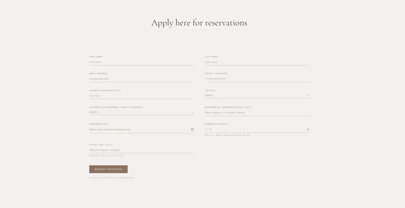
Two ways in, by audience. Brokers get a private, link-only availability calendar — live nightly rates, per-month minimums, and 48-hour holds. Everyone else gets an invitation-only request form. Both write straight through to the estate manager platform.
The challenge
What made it hard
The lookbook is a pinned, page-covering deck scrubbed by scroll progress — 28 chapters and more than 50 panels in a day-to-night arc. Choreography at that length breaks the moment it is hand-numbered.
The deck and the marketing site have genuinely incompatible styling. The lookbook needs its own bare-element CSS and design tokens; the site needs Tailwind globals, a header and a footer. One set of global styles would have poisoned the other.
A media-led deck is the easiest kind of page to make slow, and the desktop pinned-scrub layout has no meaning on a phone.
Approach
How it was built
Two isolated root layouts. The `(site)` and `(lookbook)` route groups each ship their own `<html>`/`<body>`, so the deck carries its own CSS and tokens without ever colliding with the site’s Tailwind globals or chrome.
Chapters live as data, so panels reorder without renumbering anchors. Imagery is Cloudinary-delivered as AVIF/WebP, right-sized and retina-aware, and the desktop pinned-scrub layout unfolds into a natural vertical stack on mobile. The whole deck honours `prefers-reduced-motion`.
Outcome
What shipped
Live at villatimtavio.com, with the lookbook and the broker availability view running as separate experiences inside one Next.js app.
Want something like this?
Tell me what you're building and I'll tell you honestly how I'd approach it. Replies within hours.
Prefer email? Write to me directly at — it reaches the same inbox.